


Introduction
Chances are, when you hear "0.77 cents on the dollar," an increasingly contentious subject— the gender pay gap—comes to mind. Today, we will explore a US Bureau of Labor Statistics dataset containing information about America's workforce (as of Jan. 2015) to answer the following questions:
- Which industries are most and least affected?
- Is the gender wage gap the same across all industries?
- How much does an average American salary vary by gender?
To answer these questions, we'll be importing the dataset mentioned above (available on Kaggle) into an Arctype SQLite database, where we'll use queries and dashboards to manipulate and interpret the data.
Exploring the dataset
The dataset contains 558 instances (or rows) and seven attributes (or columns). Before moving on to statistics, we’ll need to load our dataset into Arctype. Arctype is an easy-to-use SQL client for PostgreSQL, MySQL, and SQLite. With Arctype, you can create tables and visualize the dataset without the hassle of coding.
To import a CSV file as a table, simply select ‘Tables’ within any workspace, and click the upload button, located with the other table controls:

Follow this tutorial for more information.
After successfully importing the CSV data, a new tab containing the table will appear in your workspace. The Wage Gap dataset looks something like this:

Removing NULL Values from Our SQLite Dataset
Before we move on to data analysis, and to avoid discrepancies while performing a mathematical operation, we need to check our data for any null values, which can be performed using a variation of this query formula:
DELETE FROM table_name WHERE condition;
Let’s plug in our values to delete the rows where either m_weekly or f_weekly is 'Na'
DELETE FROM wageinfo WHERE 'Na' in (m_weekly, f_weekly)
Adding Calculated Columns to an SQLite Table
We now have 142 rows left—let’s add some new columns to our table that calculate basic statistics for our male-female comparison:
- m_share - Ratio of male workers to the total number of workers
- f_share - Ratio of female workers to the total number of workers
- non_weighted_all_weekly - Non-weighted average of the weekly income of the two genders
- gap - Difference between the weekly income of male and female workers
- ratio - Proportion of weekly income of female to male workers
- ratio_of_workers - Overall ratio of female to male workers
Adding new columns in SQLite is fairly simple. Just plug in your table name, desired column name, data type, and a default value (if you want):
    ALTER TABLE table_name
    ADD column_name data_type default_value(optional);
We will substitute the above query with the following values:
    ALTER TABLE wageinfo ADD m_share FLOAT NULL;
    ALTER TABLE wageinfo ADD f_share FLOAT NULL;
    ALTER TABLE wageinfo ADD non_weighted_all_weekly FLOAT NULL;
    ALTER TABLE wageinfo ADD gap INT NULL;
    ALTER TABLE wageinfo ADD ratio FLOAT NULL;
    ALTER TABLE wageinfo ADD ratio_of_workers FLOAT NULL;
Note that in SQLite, we can add only one column at a time. The repetition is, therefore, necessary to add the remaining columns.
We have initially assigned a default value of NULL to all the new columns. Now, let’s populate these columns as per their formulas:
    UPDATE wageinfo
        SET m_share = CAST(m_workers AS FLOAT)/all_workers;
    UPDATE wageinfo
        SET f_share = CAST(f_workers AS FLOAT)/all_workers;
    UPDATE wageinfo
        SET non_weighted_all_weekly = CAST(m_weekly AS FLOAT)+f_weekly/2;
    UPDATE wageinfo
        SET gap = m_weekly - f_weekly;
    UPDATE wageinfo
        SET ratio = CAST(f_weekly AS FLOAT)/m_weekly;
    UPDATE wageinfo
        SET ratio_of_workers = CAST(f_workers AS FLOAT)/m_workers;
The CAST as FLOAT command is important because division would result in values less than 1. Since the default type for these columns is INTEGER or NUMBER, the new column would have 0 as their final rounded value.
Visualizing Statistics Using Arctype Charts
Now, it's time to interpret our dataset using visualizations! Let's start by looking at occupations with the most equal and unequal incomes based on gender.
Comparing The Most Equal vs. Unequal Fields with Horizontal Bar Charts
The fields with a ratio closer to 1 can be seen as more equal fields, while a ratio value closer to 0 indicates a substantial discrepancy Using the SQL query below, we can sort the data in descending order to get the top 10 occupations with the highest proportion of female to male income:
    SELECT
        LOWER(wageinfo.occupation) AS occupation,
        wageinfo.ratio
    FROM
        wageinfo
    ORDER BY
        wageinfo.ratio DESC
    LIMIT
        10;
The output should look something like this:

Similarly, to get the most unbalanced fields, we can simply reverse the sorting order and get the top 10 results.
    SELECT
        LOWER(wageinfo.occupation) AS occupation,
         wageinfo.ratio
    FROM
        wageinfo
    ORDER BY
        wageinfo.ratio ASC
    LIMIT
        10;
To compare the ratios side by side, let's create a couple of horizontal bar charts displaying these ratios. After running the query, select 'Chart' from the options at the top of the query window. A list of chart types will appear on the right side of the app:

Select the 'Horizontal Bar Chart' option and fill in the labels for X-axis and Y-axis. The resulting charts should look like this:

...and this:

You can save these charts by clicking 'Add these charts to Dashboard' at the top-right.
More Horizontal Bar Graphs: Visualizing Female Representation in Different Occupations
To retrieve the fields with the largest share of women, we will sort the data by f_share in descending order. For the fields with the smallest share of women, reverse the sorting order and extract the top 10:
    SELECT
      LOWER(wageinfo.occupation) AS occupation,
      wageinfo.f_share * 100 AS f_share
    FROM
      wageinfo
    ORDER BY
      wageinfo.f_share DESC (or ASC for smallest share)
    LIMIT
      10;
Note: we have multiplied f_share by 100 in order to output values as percentages rather than decimals.
We will use a horizontal bar chart for this query as well. Following the same procedure, and the final charts should look like this:

...and this:

The fields in which women have the smallest share are not necessarily the fields with the most income. Therefore, looking at the problem with gender as a driving force—from this angle, at least—can be ambiguous and possibly misleading.
We can, however, draw a comparison between the share of both men and women in the most as well as least paying fields.
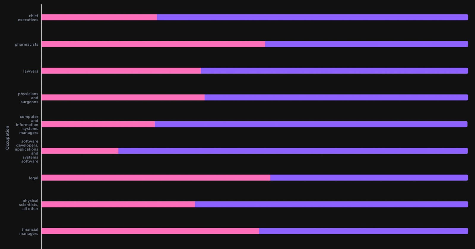
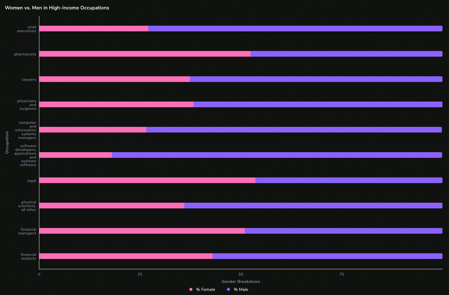
Using Stacked Horizontal Bar Charts to Visualize Gender Breakdown in High-Income Occupations
We will now extract both m_share and f_share in a single query and compare them for each occupation using a query like this:
    SELECT
      LOWER(wageinfo.occupation),
      wageinfo.non_weighted_all_weekly,
      wageinfo.f_share * 100 AS '% Female',
      wageinfo.m_share * 100 AS '% Male'
    from
      wageinfo
    order by
      wageinfo.non_weighted_all_weekly DESC (ASC for lowest incomes)
    LIMIT
      10;
Select the option of a Stacked Horizontal Bar Chart with f_share and m_share on the X-axis and occupation on the Y-axis. The resulting graphs are as follows:


We can see that the most paying fields are dominantly male-driven. The contrast is especially stark for occupations such as Chief Executives, Engineers, etc. While the situation is better in the least paying fields, in which women tend to represent a larger portion of the workforce, we can still notice that fields like Agriculture are heavily male-driven. More importantly, however, female representation is (on the whole) higher as income decreases, which would indicate that the wage gap is in fact real.
Comparing Average Incomes for Men and Women Using Multivariable Bar Graphs
We can also compare the average wages of men and women working in the same field against the overall average weekly income. This will give us some sense of whether or not the wages actually differ by gender.
First, let's extract the most paying fields sorted by the average weekly income in descending order:
    SELECT
      LOWER(wageinfo.occupation),
      wageinfo.m_weekly AS 'Male',
      wageinfo.f_weekly AS 'Female',
      wageinfo.all_weekly AS 'Overall'
    FROM
      wageinfo
    ORDER BY
      wageinfo.all_weekly DESC
    LIMIT
      10;
Select Bar Chart from the Chart Menu. Set occupation as X-label while plotting Female, Male, and Overall on Y-axis. We should get the following output:

Conclusion
In this article, we explored the wage gap in America by comparing meaningful statistics such as weekly income, shares, etc. Using SQL and Arctype to conduct analysis, we've determined the most- and least- affected fields (see ‘Most Equal vs. Unequal Fields'). The corresponding bar graph shows that occupations like Wholesale and Healthcare enjoy a fair distribution of female to male workers. On the other hand, fields such as legal and finance are substantially more skewed.
However, our analysis also indicates that occupations with considerable gender imbalances—both predominantly female and male—do not necessarily correlate with the highest- and lowest-paying jobs (see ‘Female Representation in Different Occupations’).
Therefore, we instead looked into the gender breakdown by occupation, which helped us gain insight into whether the wage gap is equal across all industries. The stacked bar charts here (see 'Gender Breakdown in High- and Low-Income Occupations') clearly show a male-dominated atmosphere, especially in higher-paying fields. On the other hand, fields with lower wages such as cashiers and housekeeping are primarily female-driven. While the wage gap differs by industry, most of them still skew substantially towards males.
To answer the last question—regarding how income varies with gender—we extracted the overall average weekly income for each occupation, and then compared it with the male and female weekly income (see 'Comparing Average Incomes'). We could not help but notice that the female income is less than the average income in most—if not all—categories. Inevitably, male income exceeded that threshold by quite a margin.
The data here is clear: in a world where women comprise 49% of the population, we still have to work on inclusivity and our perception of gender—especially in the workforce.
Written by Igor Bobriakov